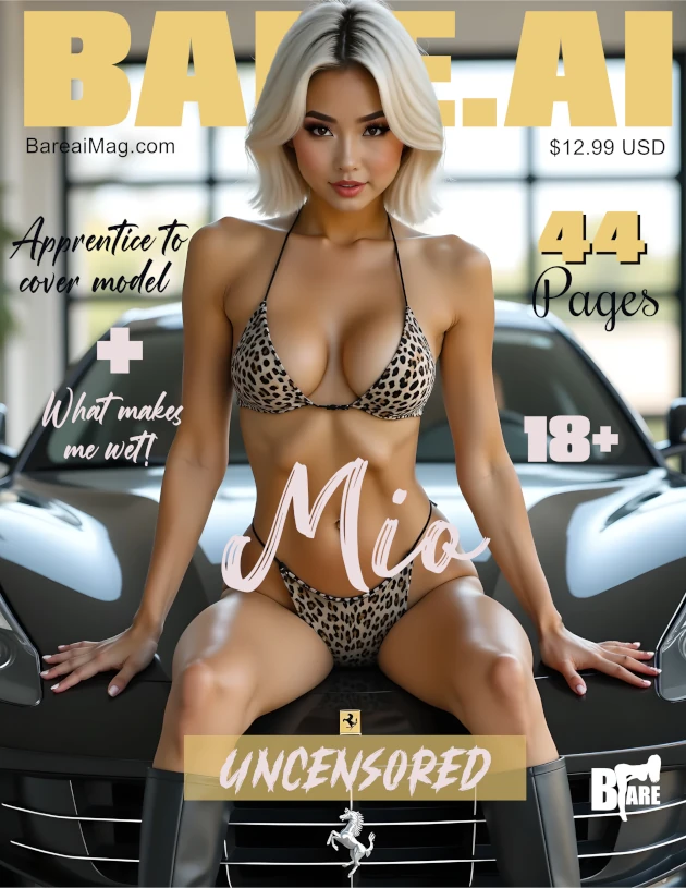
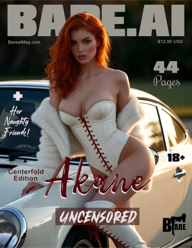
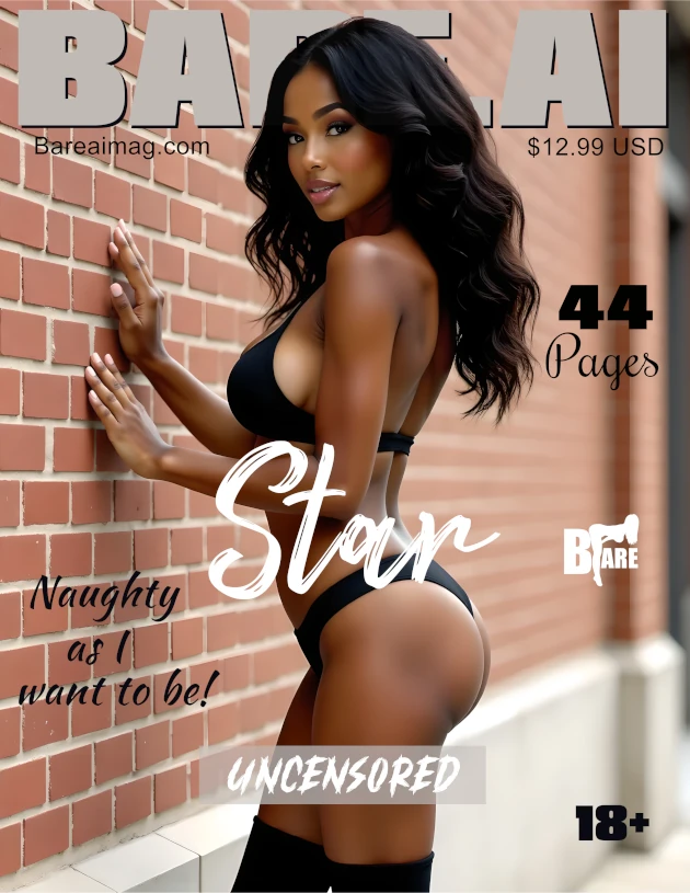
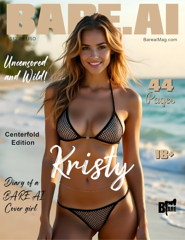
A magazine cover isn’t just another picture — it’s the first impression of an entire issue. It sets the tone. It creates curiosity. It invites the reader into a world. When the cover works, everything feels elevated and intentional. When it doesn’t… something always feels “off,” even if the viewer can’t explain why.
The good news?
A great magazine cover image usually follows a few simple visual principles. And once you understand them, you’ll start to notice instantly which images will work well — and which ones won’t.
This guide is here to help models understand what makes a cover image strong, clean, and visually impactful — so when you submit images, you feel confident about how they’ll translate into a professional magazine layout.
📌 1. Composition Matters — Keep It Clean & Focused
A strong cover image feels intentional — the eye immediately knows where to look.
A good cover image usually has:
✔ a clear subject (that’s you!)
✔ no unnecessary clutter
✔ a background that supports the image — not competes with it


When the background is full of objects, patterns, or bright distractions, the viewer’s attention gets pulled everywhere at once. A simple background allows YOU to be the star.
📌 2. Leave Headroom — Don’t Crop Too Tight at the Top
Magazine covers almost always include text at the top — the masthead — plus additional titles or feature lines. If your head is touching the top edge, there’s nowhere for that text to live.
Good headroom gives:
✔ space above the head
✔ breathing room
✔ a polished editorial look


If the framing feels cramped, the cover will always look awkward. Think of it like air — the image needs room to breathe.
📌 3. Center Balance & Body Position
Covers work best when the model is clearly the focal point — usually centered or very deliberately positioned.
Strong framing looks:
✔ balanced
✔ stable
✔ visually grounded


It doesn’t have to be mathematically perfect — the goal is simply for the viewer’s eye to land on you immediately, not wander around trying to figure out what the focus is.
📌 4. Watch the Edges — No Accidental Cropping
A common mistake is when:
🚫 hands get cut off
🚫 the top of the head is sliced off
🚫 an elbow vanishes halfway
These create tension in the image — they feel accidental instead of artistic.


Good crop = intentional.
Bad crop = awkward and accidental.
📌 5. Lighting & Clarity
A great cover should feel crisp, clear, and well-lit.
Ideal lighting is:
✔ bright enough to show detail
✔ flattering
✔ consistent
✔ free from heavy grain or blur


If your face or expression disappears in the shadows, the emotional connection disappears with it.
📌 6. Pose & Expression — Confidence Reads on the Cover
The most important element of a magazine cover is presence.
Great covers feel:
✨ confident
✨ intentional
✨ relaxed
✨ emotionally engaging


The viewer should immediately feel:
“I want to know more about this person.”
That’s the magic of a great cover.
📌 7. Keep the Outfit & Styling in Harmony
The best covers avoid visually “loud” combinations like:
🚫 clashing colors
🚫 chaotic prints
🚫 too many elements competing at once
Simple styling lets the model + emotion do the talking.
📌 8. The Most Common Cover Mistakes (So You Can Avoid Them!)
Here are the mistakes I see most often:
❌ Head touching the top edge
❌ Background too busy
❌ Off-center without intention
❌ Awkward crop at forehead or chin
❌ Subject placed too low in frame
❌ Blurry or poorly lit
❌ Too much empty space with tiny subject
❌ Distracting elements in the background
When you look at an image and something just feels “not quite right,” chances are it’s one of these.
📋 A Simple Checklist for Models
Before submitting a potential cover image, ask yourself:
✔ Is the background clean?
✔ Am I centered or clearly the focal point?
✔ Is there space above my head?
✔ Is the lighting flattering & clear?
✔ Is nothing important accidentally cropped?
✔ Does the pose feel confident and intentional?
✔ Would I stop scrolling if I saw this as a cover?
If the answer is YES to most of these — you’re probably holding a strong cover image.
❤️ Final Thought
Great cover images don’t happen by accident.
They’re a mix of good composition, clarity, space, balance, and emotion.
And when everything aligns — the result is timeless.
If you’re a model interested in appearing in a future issue, you can learn more here:
And if you’d like to explore the magazine collection:
I hope this guide helps you feel more confident choosing (or creating) cover-worthy images — and I can’t wait to see what you create next.


